이 포트폴리오는 PC 화면에 맞춰 만들었습니다.
PC에서 열어 주세요.

This portfolio is made for larger screens.
Please open it on a computer.

Back

[ Feb 2026 - May 2026 ]

KNOT v 1.0 (2026)

ROLE
Product Designer
Sole designer, end to end
TEAM
1 Engineer
CLAUDE (AI)
PLATFORM
PC Web

Overview

KNOT is LYNC’s design system, bringing together
code, resources, and UX guidelines based on
LYNC’s design language.

It provides the foundation teams need to design and
build efficiently, with ready-to-use components that
ensure a consistent user experience.

Knot

Like a knot that connects and secures ships,
it brings recurring design decisions across
LYNC together under one shared standard.

A knot has a defined way of being tied for
each purpose, making simple actions
consistent and reliable.

KNOT brings the same principle to design.

It turns recurring design decisions into shared
components and rules, creating a consistent foundation
across LYNC’s 9 core modules and 45+ sub-modules.
Background

Creating consistency across complex workflows

LYNC connects vessel operations from chartering to settlement,
requiring a consistent design framework that adapts to
each module’s information and workflows.

Findings

From Redesign to Design System

As LYNC grew, recurring inconsistencies revealed the need for a
sustainable design system that could scale across modules.

Decision

Set the standard once,
instead of fixing it in every module.

The upfront investment was significant, but it was more sustainable
than repeating the same fixes as LYNC continued to grow.
Modules such as Analytics, Billing, Database and Port Expense orbit one shared standard, each linked to it by a line

Structure

From values to screens

Each layer is built on the one before it,
and carries through to every screen.

Foundation

Token

Similar records, different structures.
Users relearn the app on every screen.

How the tokens were made

See the thinking behind these tokens.

Systemising the Interface

01

Component Architecture

Four rules set before any component was built:
role, property, naming and state.

02

Library

Components arranged by usage flow.
Build screens by combining reusable
components and patterns, not from scratch.

03

Composition

Different content, shared building blocks.
Define how reusable components come
together to form flexible interfaces.

How the systems were made

See the thinking behind of the process.

Final
Notes

Alignment

What began as a tool for consistency evolved into a
shared foundation for design and development.

By aligning around the same rules, teams spent less
time resolving implementation differences and more
time improving the product.

Structure

As AI accelerated the making process, the importance
of structure became even clearer.

Effective AI collaboration was not about better
prompts, but about defining components, properties,
states, and contracts that AI could consistently
understand and follow.

System Maturity

I initially believed that building KNOT earlier would
lead to greater efficiency. However, I learned that a
system needs to emerge from a thorough
understanding of the product.

By identifying recurring problems and decisions
before defining rules, KNOT could grow around actual
product needs rather than accumulating exceptions.

How the tokens were made

Token Setup & Structure

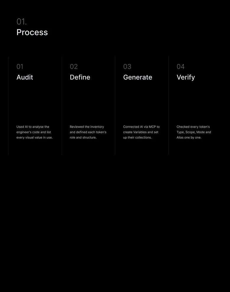
I organised the existing product’s visual values

in four steps: Audit → Define → Generate → Verify.

Process

01

Audit

Used AI to analyse the engineer's code and list every visual value in use.

02

Define

Reviewed the inventory and defined each token's role and structure.

03

Generate

Connected AI via MCP to create Variables and set up their collections.

04

Verify

Checked every token's Type, Scope, Mode and Alias one by one.

01.

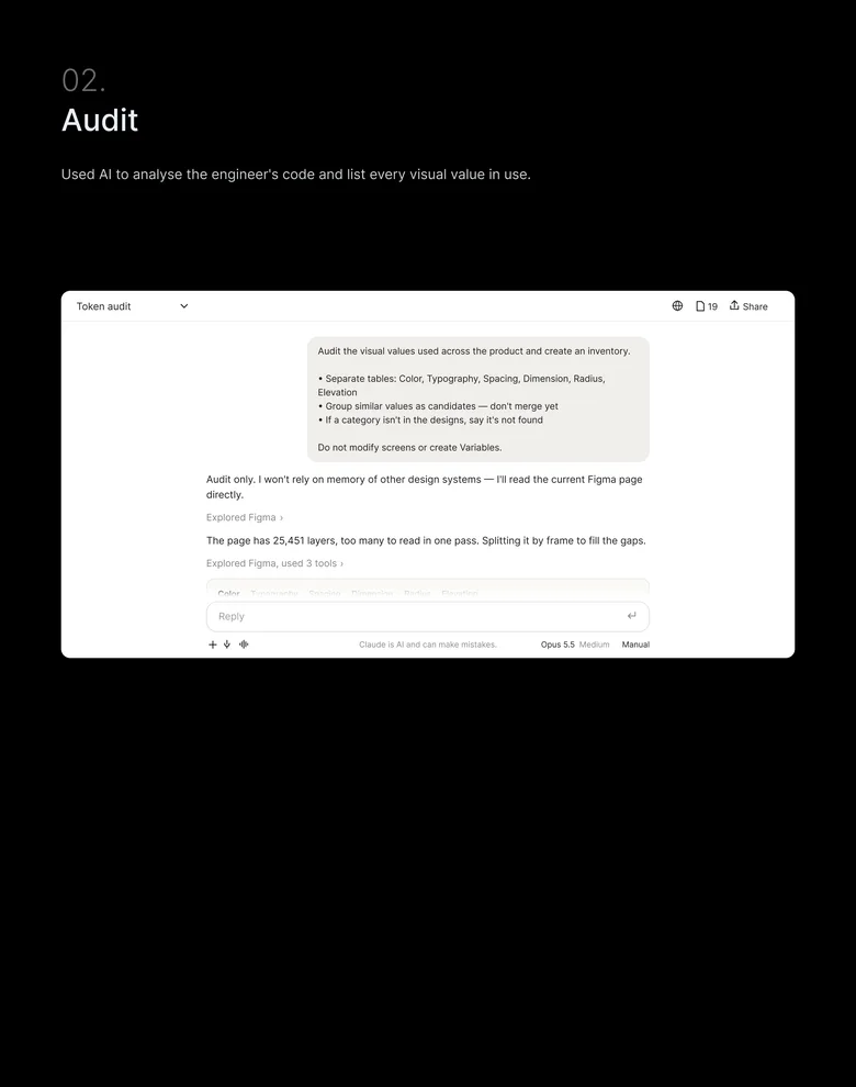
Audit

Used AI to analyse the engineer's code and list every visual value in use.

Token audit

19

Share

Audit the visual values used across the product and create an inventory.

​

• Separate tables: Color, Typography, Spacing, Dimension, Radius, Elevation

• Group similar values as candidates — don't merge yet

• If a category isn't in the designs, say it's not found

​

Do not modify screens or create Variables.

Audit only. I won't rely on memory of other design systems — I'll read the current Figma page directly.

Explored Figma

›

The page has 25,451 layers, too many to read in one pass. Splitting it by frame to fill the gaps.

Explored Figma, used 3 tools

›

Color

Typography

Spacing

Dimension

Radius

Elevation

VALUE

WHERE IT'S USED

COUNT

#FFFFFF

Surfaces, text on dark buttons

2,296

#1E293B

Body text, table values

1,898

#0048FF

Primary buttons, links

418

#789EFF

Highlighted text

163

Possible group: #1E1E1E · #1F1F1F · #141414 — not merged yet

Audit only — no screens changed, no Variables created.

Reply

Claude is AI and can make mistakes.

Manual

Medium

Opus 5.5

02.

Define

Reviewed the inventory and defined each token's role and structure.

Token plan

19

Share

Update the consolidation plan.

​

• Merge #171717 → #171719, blur 30 → 32, radius 99 · 1000 → 9999

• Exclude layout widths, iOS bars and decimals like 9.286px

• Define brand #0066FF; add Disabled, Success, Warning, Error

• Naming: {Usage}/{Role}/{Variant}

​

Do not change Figma yet.

Plan only. Nothing in Figma will change until you approve it.

Read audit inventory

›

Spacing 3, 5, 9, 13, 15 sit off the 4px grid. Snapping them to 4, 4, 8, 12, 16 keeps every gap within 1px of today's layout.

Read audit inventory, used 2 tools

›

Decision log

Naming

New values

VALUE

DECISION

REASON

#171717 → #171719

Merged

One step apart, not visible on screen

Blur 30 → 32

Merged

Same visual weight

Radius 99 · 1000 → 9999

Merged

All three render as a pill

9.286px · 30.5px

Excluded

Decimal artefacts, not design intent

#0066FF

Defined

Brand color

Success · Warning · Error

Added

No status colors existed

Structure: Color = Atomic + Semantic · Spacing, Radius = single layer

Plan updated. The decision log is kept so every change can be traced.

Reply

Claude is AI and can make mistakes.

Manual

Medium

Opus 5.5

#0066FF

: Value

Blue-50

: Atomic (Primitive)

Foreground-Brand-Primary

: Semantic

16px

Spacing-16

No Atomic step

: Value

: Global

Colour

Typography · Spacing · Radius · Size

Colour

Appearance

03.

Generate

Connected AI via MCP to create Variables and set up their collections.

Variables

Collections

Atomic

247

Semantic

359

Global

90

Groups

All

359

color

359

Search

Name

Brand Light

Brand Dark

Ocean Light

Ocean Dark

accent

basic/default

basic/default

sky/600

sky/400

color /

background

primary

basic/white

slate/900

basic/white

slate/900

secondary

slate/100

slate/700

slate/100

slate/700

tertiary

slate/50

slate/800

slate/50

slate/800

inverse

black/dark

basic/white

black/dark

basic/white

success

green/100

green/900

50%

green/100

green/900

warning

orange/100

orange/900

50%

orange/100

orange/900

danger

red/100

red/900

50%

red/100

red/900

info

blue/100

blue/900

50%

blue/100

blue/900

accent

basic/default

basic/default

sky/600

sky/400

active

blue/50

blue/950

sky/50

sky/900

inactive

slate/100

slate/700

slate/100

slate/700

Create variable

#0048FF

basic/default

Value

Atomic

VALUE

ATOMIC

SEMANTIC

04.

Verify

Checked every token's Type, Scope, Mode and Alias one by one.

01 TOKEN NAME

Follows the naming rule

Foreground-Brand-Primary

Usage – Role – Variant

02 REFERENCE VALUE

References an Atomic token

Foreground-Brand-Primary

→

Blue-50

03 SCOPE

Scoped by use, Atomic hidden

Text fill

Blue-50

04 TOKEN LIST

Only planned tokens listed

Token plan 359

=

Variables 359

With these tokens, changing the theme or switching to dark mode updates everything at once, without recolouring each component one by one.

Components reference only Semantic and Global tokens, so theme and mode changes reach the entire UI without editing a single component.

Rather than designing each screen individually, the Library was built so that screens are composed from defined components and patterns.

How the systems were made

Systemising the Interface

Before building components, I defined the function and visual role of recurring UI elements and structured them into standardised rules.

This let each component be reused across different contexts, and new screens be designed and built on the same criteria.

01.

Component Architecture

Group components by function, not appearance. Each component serves a distinct purpose, separating mixed-use inputs into text fields, text areas, and dropdowns.

Role

How to split it

Most LYNC modules show many records at once,

and the type and length of information in each row varies.

Without creating new patterns, important values had to stay uncut within the existing components and rules.

Main Grid

Define each property's role and combine only

the options needed, keeping the structure flexible

for future extensions.

Property

What can change

Name components by style and properties, not use cases, ensuring consistent understanding across contexts.

Naming

How to name it

Standardise core states across components, with error handled as a separate, independent property.

State

How to show state

Rather than introducing new patterns for each screen,

I established reusable information components and composition rules that accommodated the distinct needs of each module while maintaining consistency across the product.

02.

Composition

Rather than building each grid as a single unit,

I broke information down into role-based components

that could be combined to form different grid structures

(Cell = Component, Row = Recipe).

To make this system understandable and applicable by AI,

I documented each component’s properties, usage conditions, and composition rules as a set of contracts.

03.

Building with AI

KNOT was built independently, with AI supporting repetitive analysis and generation tasks.

I used AI to analyse existing code and Figma files, define component structures and usage rules, and formalise properties and constraints through Contracts.

This established a shared structure AI could follow, while generated outputs were reviewed, refined, and fed back into the system.

Thinking…

Reply…

KNOT was built independently, with AI supporting repetitive analysis and generation tasks.

I used AI to analyse existing code and Figma files, define component structures and usage rules, and formalise properties and constraints through Contracts.

This established a shared structure AI could follow, while generated outputs were reviewed, refined, and fed back into the system.

Grace 5.5

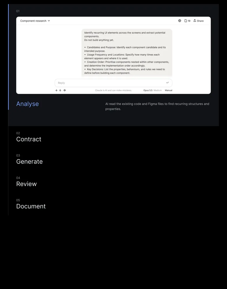
01

Component research

19

Share

Identify recurring UI elements across the screens and extract potential components.

Do not build anything yet.

​

• Candidates and Purpose: Identify each component candidate and its intended purpose.

• Usage Frequency and Locations: Specify how many times each element appears and where it is used.

• Creation Order: Prioritise components nested within other components, and determine the implementation order accordingly.

• Key Decisions: List the properties, behaviours, and rules we need to define before building each component.

​

Recommend the first component to build and explain why it should be prioritised.

Thinking…

Research only. For external design systems, I’ll read the current documentation directly rather than rely on memory.

Explored web

›

Couldn’t retrieve the page body. I’ll fill the gap with a search.

Explored web, used 1 tool

›

Research only — nothing has been built. For reference, this file already has a Button set (72 variants); the findings below are organised from scratch, separately from that set.

1. Buttons in our designs

Across the three screens there are 39 button-like nodes — 9 distinct specs once duplicates are removed. Only 12 are visible on screen; the other 27 are empty slots left by components.

2. Candidates and purpose

•

Button — primary and secondary actions such as Record Payment.

•

Table/Cell — one slot per column, typed by the shape of the data.

•

Badge — status labels inside cells, such as SM COST and FDA.

1 minute ago

Reply

Claude is AI and can make mistakes.

Manual

Medium

Opus 5.5

Analyse

AI read the existing code and Figma files to find recurring structures and properties.

02

Button specification

19

Share

Based on the audit findings, let’s define the Button specifications.

​

• Types vs. States: Separate which variations should be treated as button types and which should be treated as states.

• Component Properties: Recommend which Component Properties should be used to represent each variation and explain the reasoning.

• Out of Scope: Separately identify any variations found during the audit that we don’t seem to need at this stage.

​

Once the structure is clear, create a final specification table covering:

• Type • Size • State • Default value for each property

​

Do not create anything in Figma yet.

Thinking…

Types vs. States

Type = Hierarchy (Primary / Secondary / Tertiary / Quaternary / Outline / Ghost) × Tone × Size (lg 48 / md 40 / sm 32)

State = Default / Hover / Pressed / Disabled

Tone is a type dimension, not a state — it changes the fill and label colour, not the interaction:

•

Primary: Default / Danger

•

Outline: Default / Danger / Gray

•

Tertiary: Normal / Blue / Red

•

Secondary, Quaternary, Ghost: one tone only

States missing from the current designs

State

Existing specification

Recommendation

Focused

Icon Button only

Add one shared focus ring for every button, using color/border/focus

Loading

Not available

Add for actions such as Record Payment and Apply. A spinner asset is also needed

Disabled

Missing on Ghost

Reuse the color/button/*/bg-disabled tokens

Selected

Clickable and Tab only

Keep it on those two; standard buttons don’t need it

Variant vs. Component Properties

Variant: 3 dimensions — Size, State, Tone. Figma can’t change colours through Component Properties, so Tone and State stay as Variants.

•

Button - Primary: 3 sizes × 4 states × 2 tones = 24 variants

•

Alternative: drop Pressed and handle it in prototyping — fewer variants, but pressed states disappear from static designs

Property

Type

Purpose

Label

Text

Button label

Leading icon

Boolean + Instance swap

Show/hide and replace the leading icon

Trailing icon

Boolean + Instance swap

Secondary only — e.g. a chevron

Width

Auto Layout (Fill / Hug)

Hug by default; Fill in dialogs and drawers

Recommended Out of Scope

Element

Reason

Recommendation

.Icon Button

No label and its own touch target; used in table rows and headers

Keep as a separate Icon Button component

Grid Toggle

A segmented control, not an action

Move to its own component

Final Button Specification

Dimension

Values

Default

Type

Primary / Secondary / Tertiary / Quaternary / Outline / Ghost

Primary

Size

sm 32 / md 40 / lg 48

sm

State

Default / Hover / Pressed / Disabled

Default

Tone

Default / Danger (Primary)

Default

Recommended scope: 24 variants for Button - Primary and 4 Component Properties. Focused and Loading need further specification.

Reply

Claude is AI and can make mistakes.

Manual

Medium

Opus 5.5

Contract

Audit findings became a Button specification: types, states, properties, and what stays out of scope.

03

Build Button in Figma

19

Share

Create the Button component in Figma according to the specifications we’ve defined.

​

• Search First: Check whether components with the same purpose already exist before creating anything.

• Auto Layout: Build the component using Auto Layout.

• Semantic Tokens: Connect colors, spacing, and corner radius to the registered Semantic Tokens.

• Missing Tokens: If any required tokens are missing, do not create new ones arbitrarily. Report them instead.

• Base First: Create the Base component first and report back. Wait for my confirmation before adding Variants.

• Scope Control: Do not create any other components until the Button component is fully completed.

Thinking…

Searched components — “Button”

›

Found Button sets on the ◇ Button page. Nothing matches the new specification exactly, so I’ll build the base on that page instead of creating a second Button elsewhere.

Read 46 variables — color/button, spacing, component/button

›

Base component created

❖ Button - Primary / Base

Label

Fill

color/button/primary/bg

Height

component/button/height-md

Radius

component/button/radius

Padding

spacing/3 · spacing/2

Gap

spacing/1

Built with Auto Layout (horizontal, Hug) and bound only to registered semantic tokens. Label and Leading icon are exposed as Component Properties.

Missing tokens — not created

•

color/border/focus — needed for the Focused state

•

icon/spinner — needed for Loading

The base is ready for review. I’ll wait for your confirmation before adding Variants.

Reply

Claude is AI and can make mistakes.

Manual

Medium

Opus 5.5

Generate

AI built the component in Figma with Auto Layout and semantic tokens — base first, variants only after review.

04

Design System_V1 (2026) / ◇ Button

19

Share

sm

Default

Danger

md

Default

Danger

lg

Default

Danger

Leading icon: True

Default

Disabled

Hover

Pressed

Leading icon: False

Default

Disabled

Hover

Pressed

Label

Label

Label

Label

Label

Label

Label

Label

Label

Label

Label

Label

Label

Label

Label

Label

Label

Label

Label

Label

Label

Label

Label

Label

Label

Label

Label

Label

Label

Label

Label

Label

Label

Label

Label

Label

Label

Label

Label

Label

Label

Label

Label

Label

Label

Label

Label

Label

Review against the specification

✓ 24 variants — Size 3 × State 4 × Tone 2

✓ Fill, padding, gap and radius bound to semantic tokens

✓ Auto Layout on every variant, Hug by default

✓ Label and Leading icon exposed as Component Properties

! Focused and Loading wait for color/border/focus and a spinner

Review

The generated component page was checked against the specification before it joined the library.

05

Button.tsx

button.contract.md

CLAUDE.md

INDEX.md

KNOT

CLAUDE.md

▾ docs

INDEX.md

▾ tokens

primitive.json

semantic.json

component.json

▾ contracts

button.contract.md

table-cell.contract.md

badge.contract.md

▾ src/components

▾ Button

Button.tsx

1

import { cva } from "class-variance-authority";

2

import { Icon } from "../Icon";

3

4

const button = cva("knot-button", {

5

variants: {

6

type: { primary: "btn-primary", outline: "btn-outline", ghost: "btn-ghost" },

7

size: { sm: "h-sm px-3", md: "h-md px-4", lg: "h-lg px-5" },

8

tone: { default: "", danger: "tone-danger" },

9

},

10

defaultVariants: { type: "primary", size: "sm", tone: "default" },

11

});

12

13

export function Button({ type, size, tone, leadingIcon, children, ...props }) {

14

return (

15

<button className={button({ type, size, tone })} {...props}>

16

{leadingIcon && <Icon name={leadingIcon} size={size} />}

17

<span>{children}</span>

18

</button>

1

# Button — Contract

2

> Source: Figma ◇ Button · src/components/Button

3

4

## Types

5

Primary · Secondary · Tertiary · Quaternary · Outline · Ghost

6

7

## Properties

8

| Prop | Values | Default |

9

| size | sm · md · lg | sm |

10

| state | default · hover · pressed · disabled | default |

11

| tone | default · danger (Primary only) | default |

12

| leadingIcon | Icon name | — |

13

14

## Rules

15

- One Primary button per view.

16

- Danger tone only for destructive actions.

17

- Bind to {`\`color/button/*\``} and {`\`component/button/*\``} tokens only.

1

# KNOT — instructions for AI

2

3

Before any design-system task, read `docs/INDEX.md` first.

4

Follow the contracts it links to.

5

Never create tokens or components that are not listed there.

6

If something is missing, report it instead of inventing it.

1

# KNOT Index

2

> Table of contents for the design system. Read this first.

3

4

## Tokens

5

- Primitive → docs/tokens/primitive.json

6

- Semantic → docs/tokens/semantic.json

7

- Component → docs/tokens/component.json

8

9

## Components → contracts

10

- Button → docs/contracts/button.contract.md

11

- Table/Cell → docs/contracts/table-cell.contract.md

12

- Badge → docs/contracts/badge.contract.md

13

- Textbox → docs/contracts/textbox.contract.md

14

- Dialog → docs/contracts/dialog.contract.md

Document

Code, contracts and an index were written down so AI can find and follow the system.

04.

Outcome

Using AI and KNOT together reduced the repetitive work between design and development, and let us reflect client requirements faster.

With organised components and rules, the engineer could start building on the same day a design was handed over, and I could keep pace with development while designing alone.

1/3

As a result, building an efficient workflow cut the overall project timeline by about one third,

96%

and 96% of the clients we met responded positively to the faster development speed.

KNOT became more than a tool for faster design work. It became the working foundation that lets design and development share the same criteria and move faster together.