01
Identification
SOLVES DIVERGENCETell records apart at a glance.
이 포트폴리오는 PC 화면에 맞춰 만들었습니다.
PC에서 열어 주세요.
This portfolio is made for larger screens.
Please open it on a computer.
[ Mar 2025 - Jul 2026 ]
* voyages, cargo, port costs, fuel, and documents
eLSA is an operational platform for tanker operators, managing charter parties. As the existing mobile app offered limited value and was rarely used, I redesigned key workflows for mobile and built a design system to help operators work away from their desks while keeping the product consistent as it scaled.
Background
Web uses its wide screen to show and compare many data points
at once. Mobile has to decide what matters first.
01. Enable operators to continue working beyond their desks by bringing key web modules to mobile.
02. Build a design system that enables the product to scale consistently.
Discovery
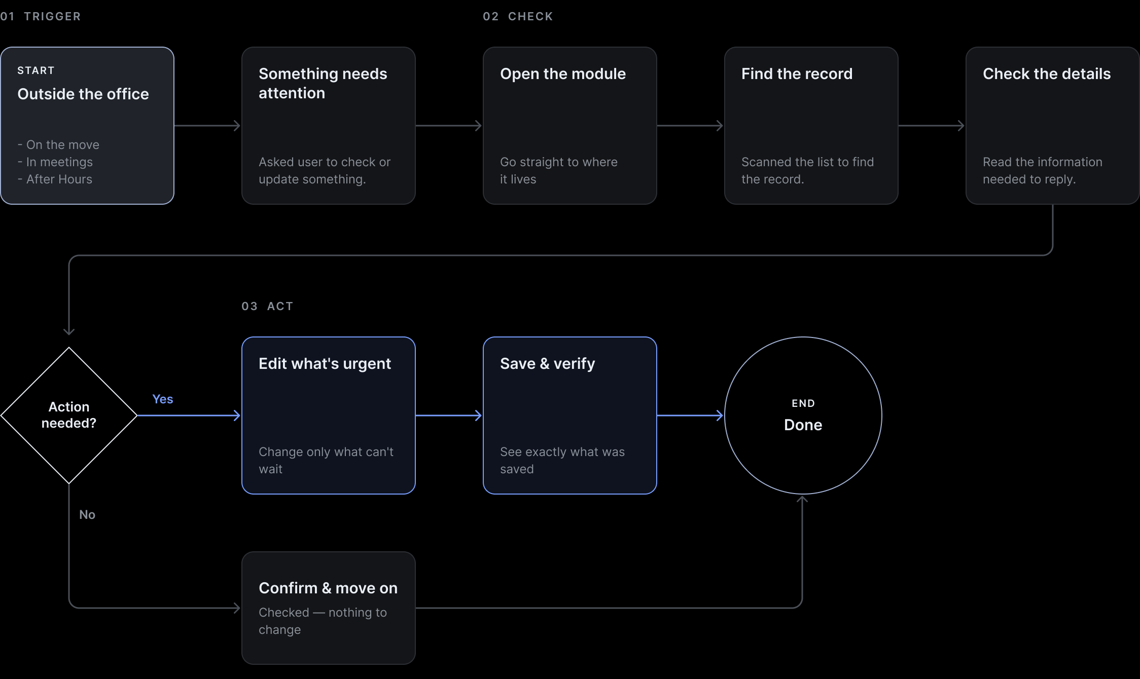
Mobile was primarily used outside the office to quickly check necessary information and complete tasks on the go,
rather than to explore and manage the full scope of work at a desk.
Findings
I reviewed the existing app against the core user flow above.
See the research behind these findings
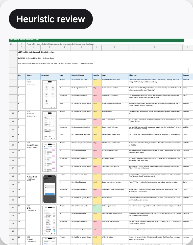
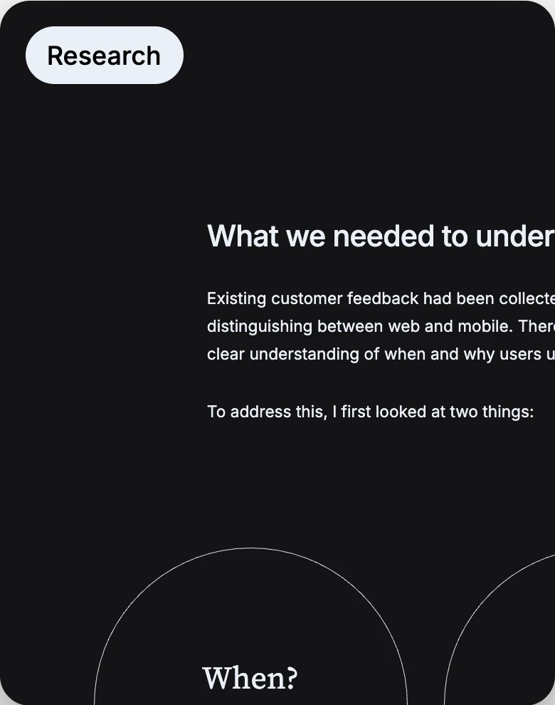
Research files · 2 documents
Click to open
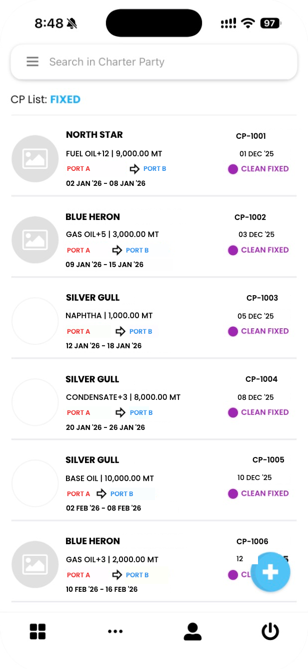
Similar records, different structures.
Users relearn the app on every screen.
Key Finding
Similar workflows needed shared structural and interaction patterns that could be applied consistently across the product.
Every module needs a different amount of information.
One fixed layout doesn't fit.
Key Finding
A shared structure was needed—
one flexible enough to adapt the amount and combination of information to each module.
States such as View, Edit, and saved/unsaved were
defined and represented differently across screens.
Key Finding
Product states needed to be defined first,
then connected to components so they
could be represented consistently.
Design System
None of the three could be fixed one screen at a time.
I built a shared design system first, then rebuilt the app on top of it.
Click to open
Solution
I rebuilt the screens behind each problem on top of the design system.
01
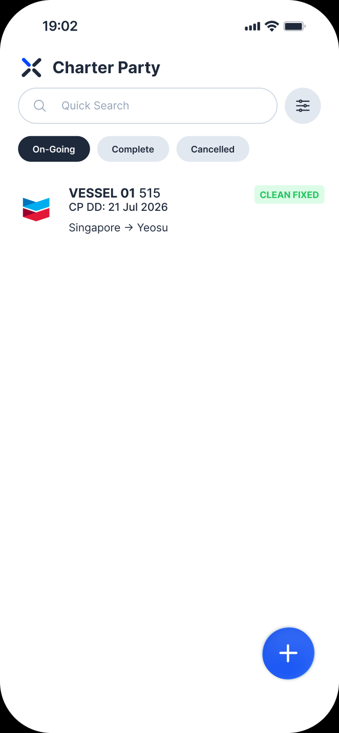
Tell records apart at a glance.
02
See the state and the next step.
03
Read information without decoding it.
Each row leads with what identifies the record.
The rest moves to the detail page.
Prioritised the strongest identifying information

The current state and the next action are shown on screen,
not hidden in gestures or colour.
01
Made the Edit action
explicit from View
02
Made colour-only states
explicit with filter chips
03
Added a View page
to confirm saved changes
Icons and empty fields were replaced with named labels,
so information reads directly.
Repeated design decisions became shared rules.
Design work moved from solving the same problems again to applying and updating shared rules across 45+ modules.
As modules grew, small inconsistencies appeared across screens. Shared principles keep the product consistent, while each module adapts to its own information and workflow.
Applying the system to mobile exposed where platform-specific rules were needed. I refined component sizing, density, and state representation, using mobile constraints to validate and evolve the system itself.
By turning recurring design decisions into reusable rules, components, and documentation,
I created a scalable framework that could be consistently applied across new screens and modules.
Design System V1 became more than a component library. It became a foundation for making, communicating, and evolving design decisions consistently across the product.