Make operators’ core tasks
faster and more accurate,
reducing operational risks
caused by misreading values.
[ Jan 2025 - Jul 2026 ]
Lync (web)
Overview
Rather than simply improving the appearance
of the interface, I fundamentally redefined the
purpose and role of each screen.
As the sole product designer, I led the
redesign across 9 core modules and more than
45 sub-modules.

Business
Goal
Address the usability debt accumulated in
legacy eLSA and establish the web experience
as the new standard for the LYNC platform.
Maintain UI and UX consistency
across the product by establishing
and applying a shared design system.
About Project
LYNC is a B2B platform designed to streamline the day-to-day operations of tanker operators. Evolved from the legacy Connect eLSA, it addresses existing usability issues by rethinking its interface and workflows.
Tanker operators use LYNC to manage their vessels across contracts, voyages, and invoices. They also track vessels, communicate with port agents and captains, and archive cargo-related documents
— bringing a wide range of operational tasks into a single platform.
Every vessel and voyage comes with different data, costs, and schedules that can change constantly. Operators therefore need to identify critical information quickly and accurately.
The legacy eLSA was effective at storing records, but less effective at helping operators get work done. Through user feedback and a heuristic review of the existing workflows, three key usability issues emerged.
PROBLEMS


01
Recognition
The interface prioritised data
volume over recognition, forcing operators to open details just to identify the right record.

02
Efficiency
Simple edits required multiple sliders and unnecessary steps, making routine tasks unnecessarily cumbersome.

03
Hierarchy
The interface presented all available data without clear hierarchy,
making it difficult to identify the information users needed.
01
Recognition
KEY STATEMENT
As the amount of information increased, important details were obscured, making it harder for users to identify what they needed.
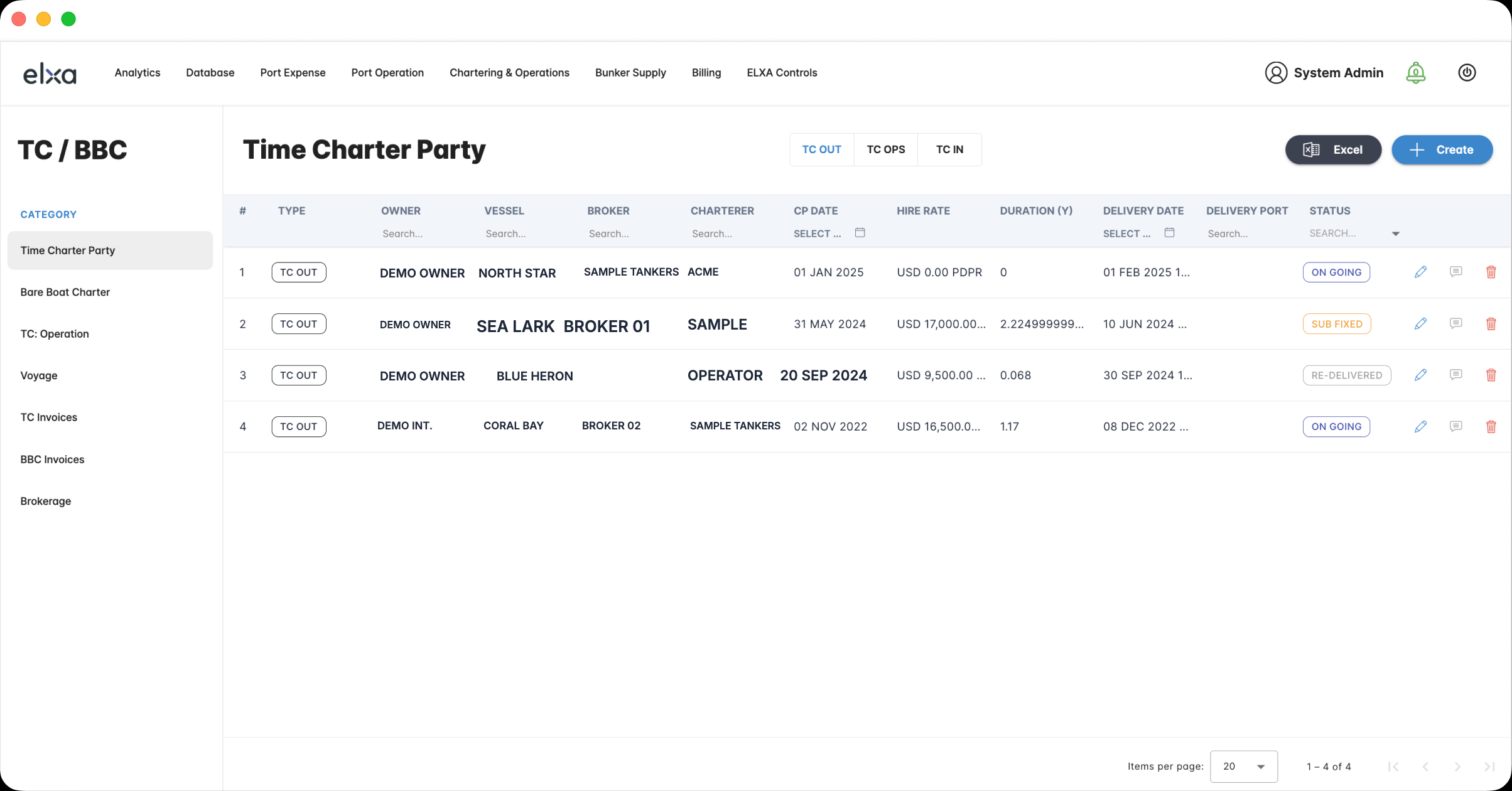
KEY FINDING
Rather than showing more information, the focus needed to be on helping users quickly identify what mattered through clear prioritization.
02
Efficiency
KEY STATEMENT
Even simple, routine tasks required unnecessarily complex user flows, making everyday work more cumbersome than necessary.
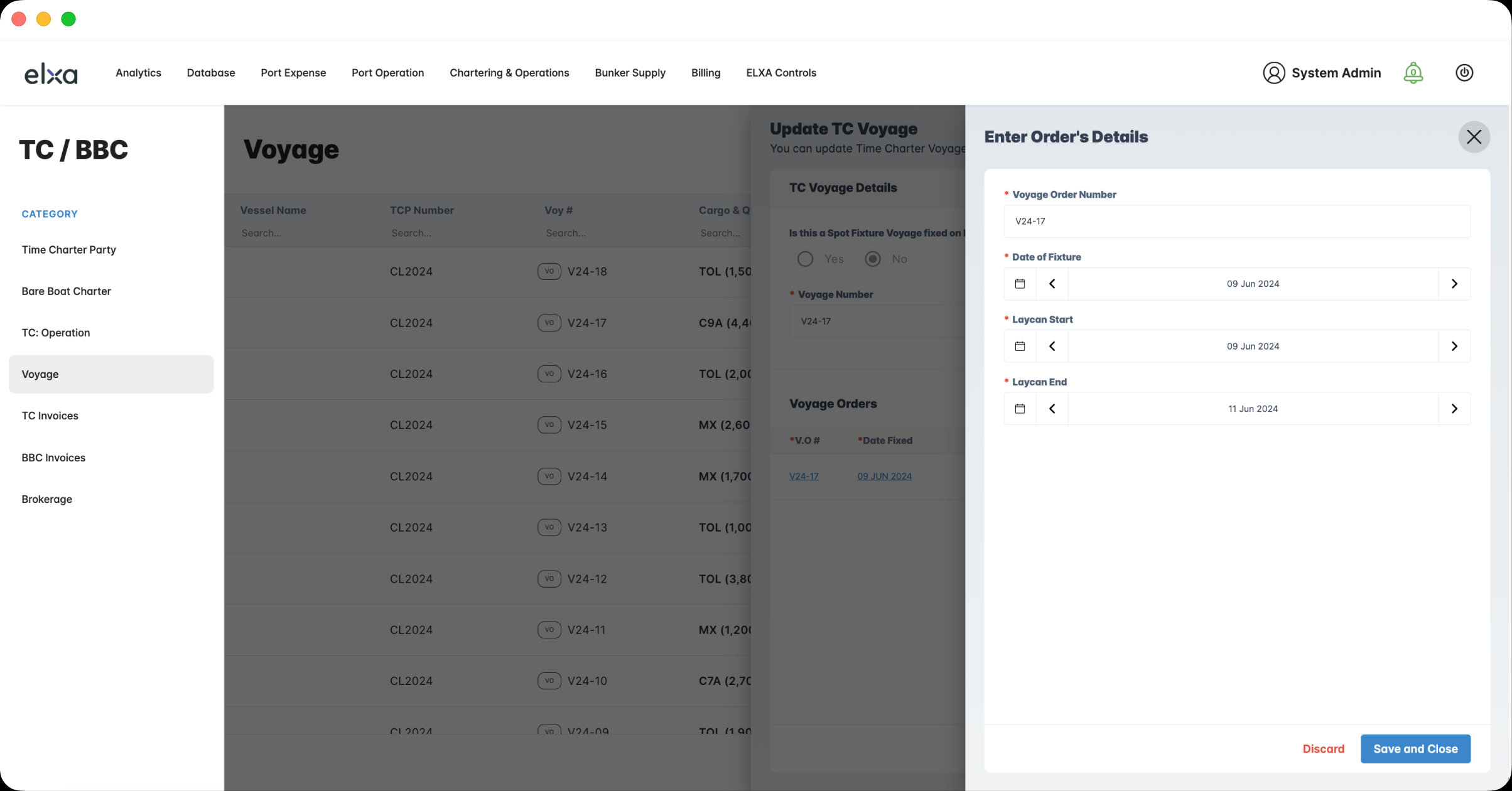
KEY FINDING
The user flow needed to be redesigned to minimize unnecessary steps, allowing users to complete simple tasks quickly and edit required information directly on the same screen.
03
Hierarchy
KEY STATEMENT
The issue was not a lack of information, but a structure that failed to clearly communicate the relationships and priorities between pieces of information.
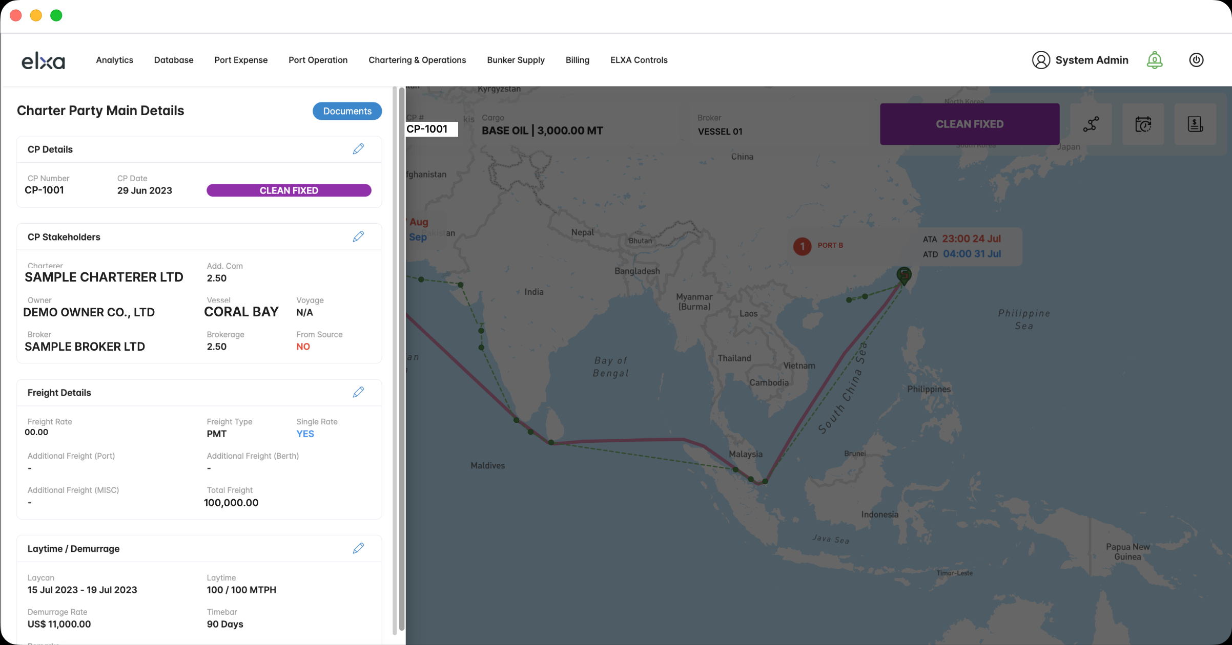
KEY FINDING
The detail page needed to be restructured by organizing information based on its importance and relationships, using cards and sections to help users quickly find what they needed.
So, how could these issues be addressed?
Rather than adding more information, I focused on helping users quickly identify
what they needed, work efficiently, and understand information clearly.
I reexamined the existing information architecture and user flows and
defined the following directions for improvement.
What the friction
actually cost
Small moments of friction created a much larger operational cost than expected.
USER BEHAVIOUR
OPERATIONAL COST
Opened detail pages
to identify records.

Spent time navigating
instead of making decisions.
Repeated multi-step edits
dozens of times a day.
Work spilled into spreadsheets
outside the platform.
Reconstructed context manually
on pages without clear priorities.
Increased error risk when
checking values without context.
Solution
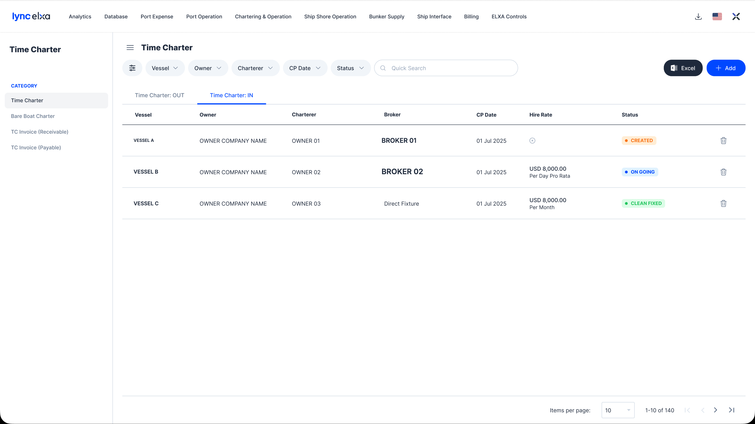
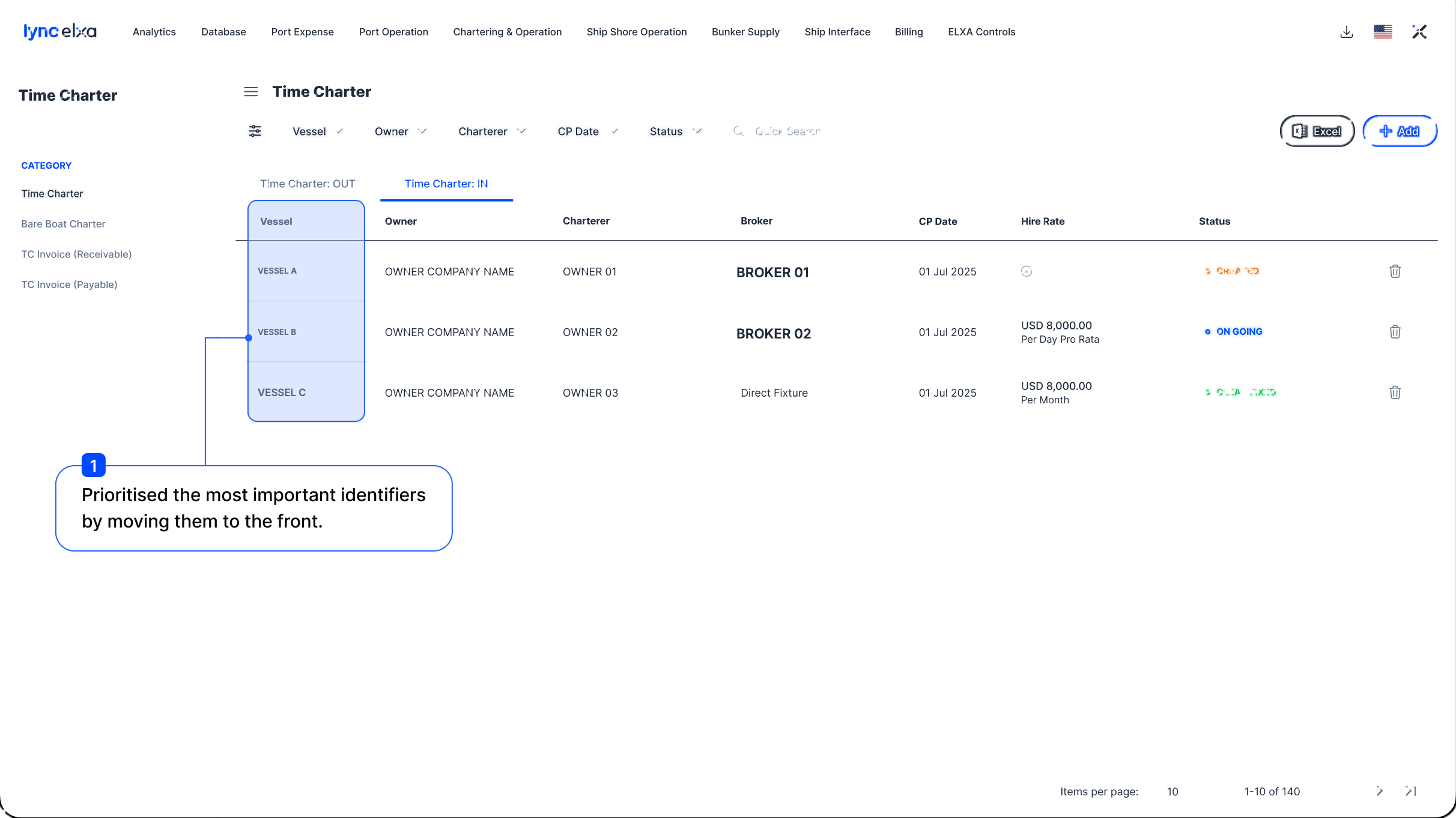
01
Redefining Information Priority
for Identification
Rather than visually refining the existing columns, I first redefined information priorities to help users identify records quickly.
02
Provided different editing flows
based on the nature of each task.
I simplified the unnecessarily complex user flow and provided
editing methods suited to the complexity of each task.
eliminating unnecessary navigation.
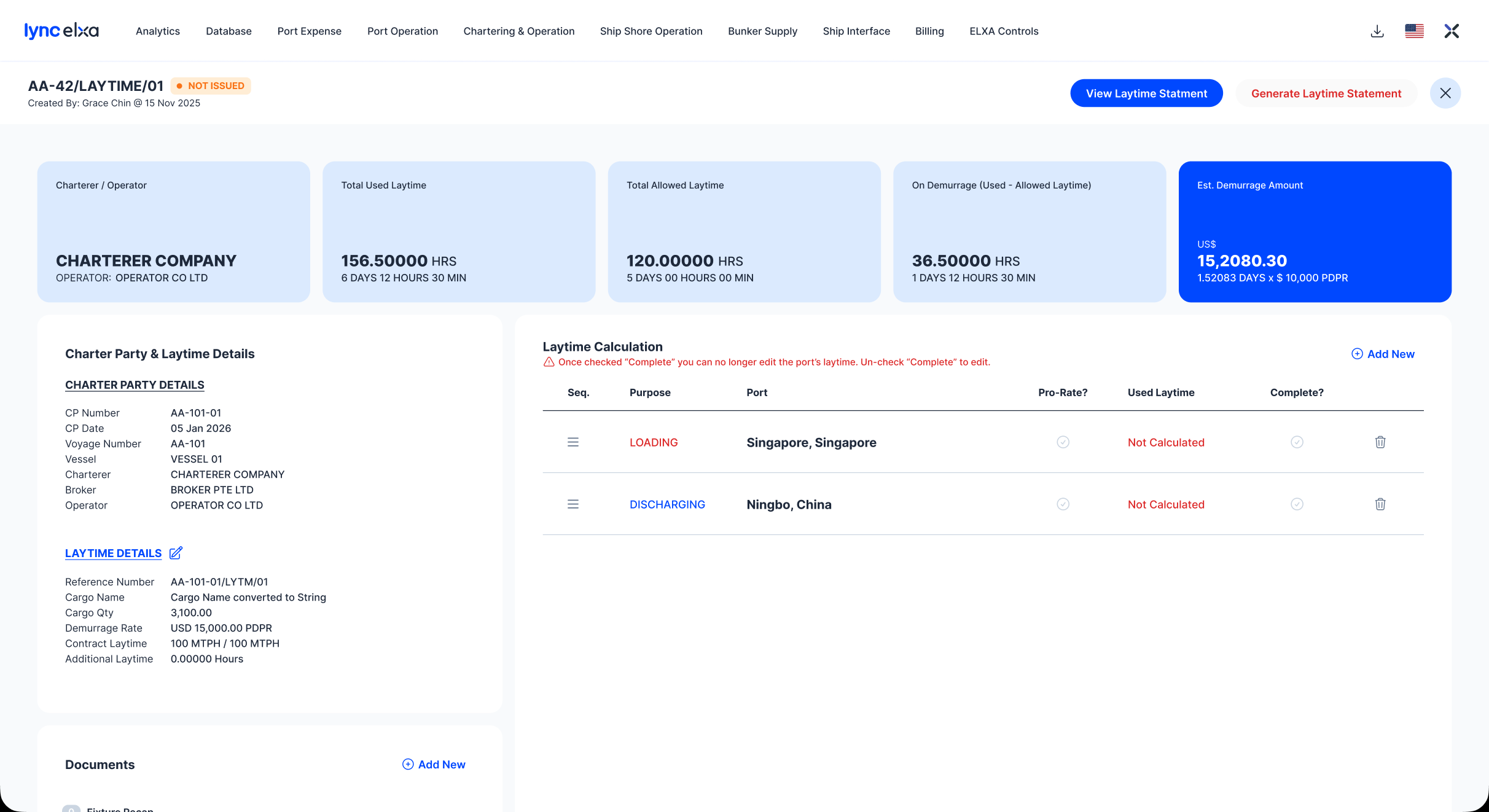
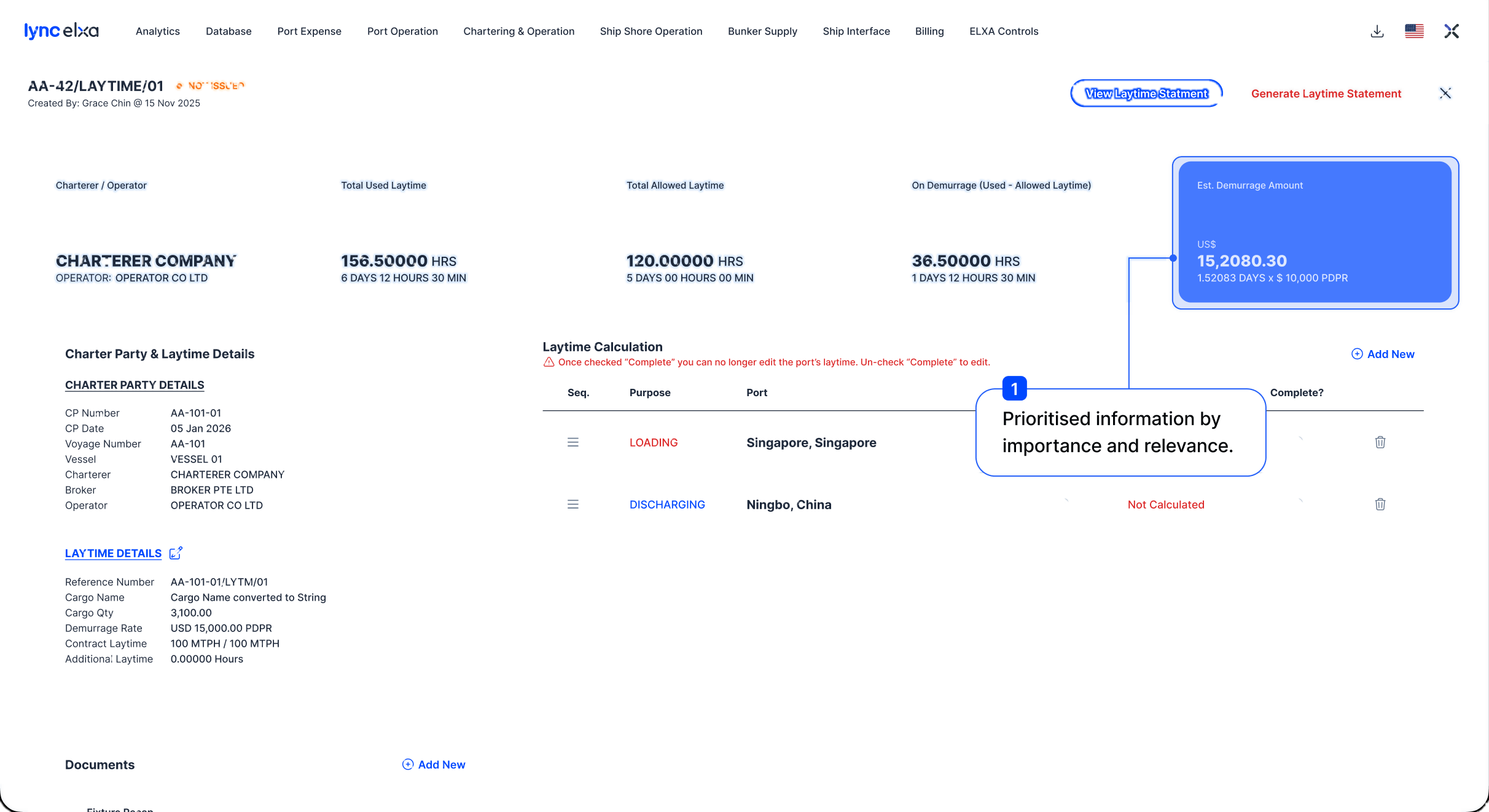
03
Restructured the hierarchy based on
information relationships and importance.
Rather than presenting all information with equal weight,
I restructured it based on its importance and relationships.
Conclusion
01
Recognition
By prioritising key identifiers, users could distinguish records faster and make quicker decisions.
02
Efficiency
By providing editing flows suited to each task, users could complete routine work with fewer steps and less friction.
03
Hierarchy
We restructured information hierarchy and relationships to help users quickly understand what matters and make decisions.
Afterwards, I interviewed customer companies to understand how the product improvements changed their workflows and use of existing tools.
As a result,
82%
of existing customer companies reported using the system as their primary work tool.
+93.2%
of companies expressed positive feedback and an intention to use the product after the introduction.
This confirmed that the improvements expanded the product beyond simply recording and viewing information, positioning it as a practical work tool for handling real tasks and supporting new user adoption.
Final Notes
Building a Scalable Design System
Working across 9 core modules and 45+ sub-modules revealed the limits of improving screens individually.
I systemised repeated structures and interactions
to create a consistent foundation across the product.
Simplifying Workflows
The redesign focused on simplifying the journey from finding a record to reviewing, editing, and confirming information.
The product shifted from presenting data to helping users quickly identify and act on what matters.
Consistent by Design
Rather than standardising every screen,
we defined three principles: Identification,
Information Hierarchy, and Edit Flow.
These principles created consistency in how users find, understand, and act on information across different modules.
Reflection
Working in an unfamiliar domain taught me that
good product design starts with understanding
how users work and make decisions.
The challenge was not showing more information,
but knowing what matters and what can be left out.